■【PartⅡ Law for Translating Music into Painting 】— Examples of Paintings in Which Color Chords Are Actually Used: Ryuzaburo Umehara’s Mount Fuji!(梅原龍三郎 富士山)

How Can Chords Be Drawn?
Representative chords—such as Do-Mi-So and Re-Fa-La—can easily be drawn as follows, based on the one-to-one correspondence between musical notes and the spectrum, can't they?
The artist who skillfully used these chords in his paintings was Ryuzaburo Umehara, who was known as a "national painter" of Japan.
I introduced this chord-drawing program in my previous post.

Examples of Paintings in Which Color Chords Are Actually Used
According to this law, the notes Do-Mi-So of a C major chord correspond to "red, yellow, and green."
Likewise, Re-Fa-La of Dm (D minor) correspond to "vermilion, yellow-green, and blue," don't they?
Now, take a look at this painting. This is Ryuzaburo Umehara's painting of Mount Fuji. When it was first exhibited, it made such a powerful impact on the public that a major newspaper (The Asahi Shimbun?) praised it as "a great masterpiece like a bases-loaded home run!"
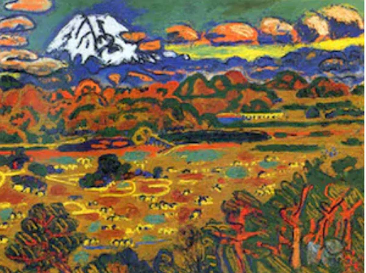
At the foot of Mount Fuji, the small mountain range is composed of "red and green, with yellow in the clouds above it," and the flat land beneath the mountains is also yellow, isn't it?
See? Isn't this a C major chord?
● What I want you to pay particular attention to is that the clouds are vermilion, and there is also "yellow." This yellow makes the entire composition stand out remarkably.
This enhances the harmony of the C major chord even further, doesn't it?
Furthermore, there is vermilion in both the mountain range and the flat land. The clouds are also vermilion, beneath them is yellow-green, and beneath that is the blue of the mountain range.
See? This is a magnificent Dm chord.
Umehara may have vaguely sensed the relationship between color and the spectrum, but perhaps he was not consciously aware of it in such a clear and explicit way.
Nevertheless, he must certainly have recognized, as a principle, the powerful harmony and effect produced by the "three-color chord"—the highly emotional impact created by the established combinations of three colors.
Because other painters could not discover this established principle, even when they tried to create works that would evoke the same powerful emotions as Umehara's paintings, they were unable to achieve it.
I was one of them.
Henri Matisse: "The painting should achieve harmony among colors. Since music can achieve harmony, there is no reason why painting should not be able to do the same."
Matisse may not have recognized that this law of color chords was based on the proportional relationship between color and the spectrum, but in his book Notes of a Painter, he wrote that "harmony can be achieved through color" and that this was how he created his paintings.
Matisse, renowned as a naturally gifted colorist, was truly remarkable, wasn't he?
Just like Umehara, he seems to have sensed it!
◆ Now, let me explain the chords used in these three paintings.
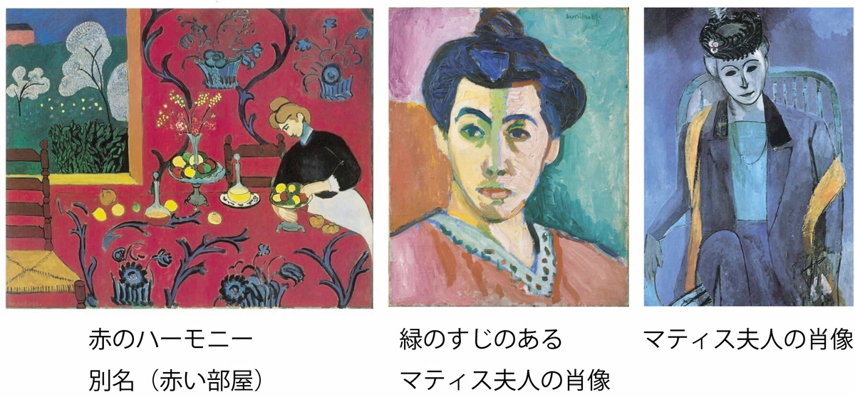
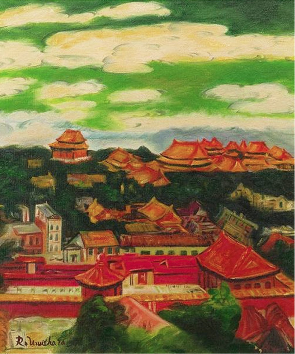
- The Red Harmony. It is correctly a red = C major chord. (Laughs.) The painting is centered on red and green, with a golden-yellow color. The reason this yellow stands out as if it were jumping out of the picture is that red forms the overall foundation of the composition, while green, its complementary color, is used in contrast to make the red stand out.
- In the middle is Portrait of Madame Matisse with a Green Stripe. In this work, Matisse used green along the bridge of the nose, dividing the face into differently colored areas on either side. Because of the boldness of this use of color, it became one of his most famous works, and Matisse and other artists came to be known as the Fauves, or "wild beasts," because their colors and brushwork were said to be "like those of wild beasts."
Now you can see it too. C major. But because the hair is blue, if we focus on this area, we have "blue, vermilion, and a yellow-green stripe along the nose"—precisely Dm.
Just like Umehara's Mount Fuji, both C major and Dm are used within a single painting.
"Both works astonished the media and people in the art world when they were first exhibited!"
That is why the effect of consciously using color chords is so powerful.
- The Portrait of Madame Matisse in the right corner... As I recall, Madame Matisse saw this painting and became quite displeased with it, perhaps even causing a negative effect on their marriage. But is that really what happened?
For details about this, please see this page.
Around this period, perhaps Matisse was concerned about Cubism. He began depicting women with exaggerated, freely curved forms, almost like a "longhorn beetle," and there were cases in which female clients who had been painted became angry and rejected the portraits.
I do not think this particular work is especially successful either.
However... what we should look at is this blue. It has an exceptionally refined, almost icy or crystalline coolness and beauty.
And this, too, is a Dm chord: blue, yellow-green, and vermilion. The green here is probably the emerald green of oil paint.
By applying his paint thinly—a major characteristic of Matisse's technique—he reduced the intensity of the green, while incorporating yellow into the neighboring vermilion, creating the sensation of yellow-green. This is an example of the adjacency effect of colors!
This is a transitional work resulting from Matisse's experiments with form, but here too, he uses color chords remarkably well.
Let me repeat this once again: the greatest historical colorists—color painters—such as Matisse, who was called a "magician of color," and Ryuzaburo Umehara, who was praised by Renoir with the words, "You have a natural talent for color! Your paintings are just like those of a Spaniard!"—have used color chords remarkably well.
Conversely, if one is unaware of color chords, there is a risk of being unable to create paintings that astonish and move people no matter how many paintings one produces. But once you understand them, you can also deliberately move away from them and use color in other ways to create paintings that amaze and impress the viewer.
For example, like Sanyu, the artist of the École de Paris.
Click here for other pages in this series!
■【PartⅠ Law for Translating Music into Painting ・・・ Here is the Python program】 I have finally unveiled and publicly released This Law , ending six years of secrecy surrounding it. Here is the Python program that demonstrates and verifies the law.【Go to this page!】
■【PartⅢ Law for Translating Music into Painting 】The History of Previous Research on this Law and an Examination of the Innovation and Value of My Theory【Go to this page!】
■【PartⅣ Law for Translating Music into Painting】As a Symbol of the “300-Year-Old Problem of Being Unable to Create Forms” — Rimington’s Color Piano, Which Adopted the Spectrum Correspondence Table!
【このページへ!】