■【PartⅢ Law for Translating Music into Painting 】The History of Previous Research on this Law and an Examination of the Innovation and Value of My Theory

 In this article, I examine in detail the achievements of people who, in the past, researched and attempted to "discover and combine the laws shared by music and painting." I will present the evidence showing exactly how far previous researchers had gone, and from what point my own discoveries begin.
The main references I used include Color Organ by Jörg Jewanski, which is a primary source providing a historical overview of previous research, as well as the paper and program Project Metamorphosis: Designing a Dynamic Framework for Converting Musical Compositions into Paintings, published in 2022 as one of the Project Metamorphosis projects at Chapman University in California, USA. I also examined other overseas literature and verified the prototypes, programs, and output examples using the primary sources themselves. Based on this investigation, I will clarify what my theory has solved.
Research from Newton to the Performances by Ryuichi Sakamoto and Toshio Iwai, and up to Dump Type 2022
(1) Newton created a spectrum and musical scale chart, but stopped there without taking the analysis any further.
The starting point was Newton's Opticks, published in 1704, in which he was the first to physically demonstrate a relationship between the color spectrum and the proportions of musical intervals.
He suggested that the seven-color spectrum was governed by the "same proportions that support the musical diatonic scale."
Newton divided the optical spectrum into seven colors—red, orange, yellow, green, blue, indigo, and violet—and corresponded them to the seven notes of the musical scale (D–E–F–G–A–B–C).
According to an explanation published in Nature, Newton's correspondence can be organized as follows:
D = Red
E = Orange
F = Yellow
G = Green
A = Blue
B = Indigo
C = Violet
Newton attempted to relate the proportions of the spectrum to the proportions of the musical scale, including whole tones and semitones, and stated that "the length of the colored bands may be divided in the same proportions as the lengths of strings."
However, his investigation did not progress beyond this point.
This does not correspond to my own chart, where red = C.
Krüger in 1743, and the Theosophist Blavatsky adopting Krüger's system in her 1888 book The Secret Doctrine
Krüger is said to have adopted Newton's correspondence between musical notes and colors almost as it was, while rearranging the sequence to begin with the musically natural "C = red."
In other words, he simply shifted Newton's sequence beginning with "D = red" so that it began with "C = red," while keeping the same order of colors.
Krüger's sequence (1743)
Note Color
C Red
D Orange
E Yellow
F Yellow-green
G Green
A Blue
B Violet
The reason is clear: he adjusted the system to conform to the musical conventions of the time. Musicians treated the note C (Do) as the reference point of the scale. Newton's "D = red" was musically unnatural, so Krüger adjusted the system to make it more suitable for musicians.
In other words, he transformed Newton's scientific system into a system that was easier for musicians to use.
◆So this is where my own correspondence chart was historically discovered, isn't it?
★Furthermore, the Theosophist Helena Blavatsky adopted Krüger's system in her 1888 book The Secret Doctrine.
Within Theosophical cosmology, she developed the idea that "the laws of the universe lie in numerical proportions and the harmony of vibrations," treating the correspondence between sound and color as a symbol of the "harmony of the spheres."
In 1919, Edward Maryon converted the wavelengths of light into musical octaves and claimed that red becomes C 29 octaves lower
This was the first system in the historical lineage of "sound = color" correspondence—Newton → Krüger → Blavatsky → Maryon (Marcotone)—to introduce a scientific conversion based on measured values, namely wavelengths.
Is Edward Maryon's (1919–1924) claim actually true?
In Edward Maryon's book Marcotone: The Science of Tone-Color (1924), a theory is clearly described involving "the correspondence between 12 notes and 12 colors," "the continuity of light and sound through octaves," and "the conversion of wavelengths into musical notes."
Maryon's central idea: if the wavelength of light is lowered by octaves, it eventually becomes the same musical note.
Here, it was suggested that as the frequency changes by octaves, the same color becomes brighter with each rise in octave!
So here we have arrived at something very close to my own correspondence chart, haven't we?
● Wavelength of red light (for example, 0.68 μm = 680 nm)
● Wavelength = speed / frequency
● Continue lowering the frequency of light by octaves (repeatedly dividing by 2)
Then,
approximately 29 octaves lower, it reaches the audible range (20 Hz–20 kHz).
The following is the completed version, with a Japanese translation added beneath the English text as "Japanese Translation."
300 Years of Color Piano History — Why Has a Device for Completely Translating Musical Scores into Paintings Never Been Realized?
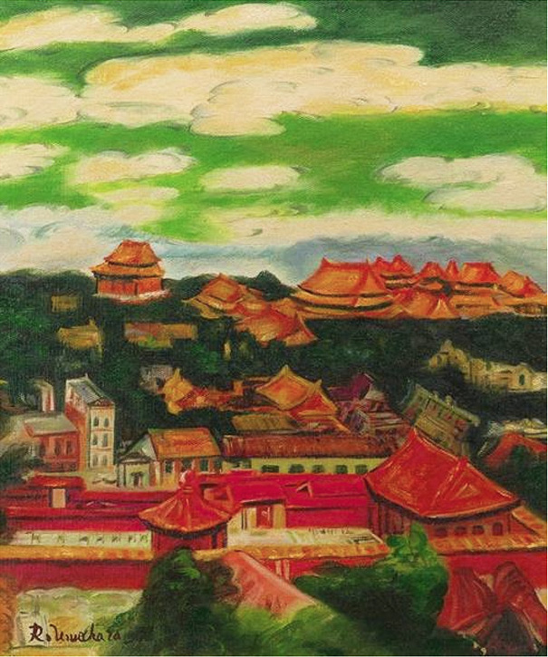
The correspondence between colors and musical notes was established by Edward Maryon in 1919. Yet even after that, whenever attempts were made to translate musical scores into paintings, why did concrete images such as the Forbidden City, female nudes, the landscapes of Guilin, and resort beaches inevitably emerge? And why has the "color piano" based on my theory never been realized until now?
Let us consider the answer by looking back at 300 years of history and previous examples.
1. Why did only the devices increase over 300 years?
Let us examine this through Color Organ by Jörg Jewanski, mentioned above.
Many color pianos appeared throughout history, including the Bishop Color Organ, Rimington Color-Organ, and Loring Musical Chromoscope. However, many of them were described as
"a purely visual stimulus that had no deeper aesthetic value — comparable to today's chains of lights at a fair."
The devices were merely purely visual stimuli without any deeper aesthetic value—like the chains of electric lights seen at fairs today.
In other words, they stopped at the level of "the pleasantness of fairground lights."
A comprehensive research site also defines the common "major problem" as follows:
"A major problem of all color organs introduced until now, was that they lacked the possibility to design forms artistically. The punctual light sources in these devices could be turned on and off and their size and intensity could be changed; however, it was not possible to produce forms that varied over time."
The major problem common to all color organs introduced up to that point was that they lacked the possibility of designing forms artistically. The point light sources in these devices could be switched on and off, and their size and intensity could be changed, but it was not possible to create forms that changed over time.
The devices could only switch point light sources on and off; they could not create artistic "forms." Much less could they display at a glance a landscape or human figure imagined by the composer. This was the fundamental problem that remained unsolved for 300 years.
2. The attempts by Toshio Iwai and Ryuichi Sakamoto also faced the same fundamental problem
There were also pioneering attempts in Japan.
★ Toshio Iwai, Piano as Image Media (1995) NTT ICC Archive YouTube Demo
A trackball is used to place points of light. The points flow toward the keyboard, and when a key is struck, shapes emerge on the screen. It succeeded in making the points move over time, but their positions were left to the arbitrariness and imagination of the audience. There was no physical necessity corresponding to "C = red."
★Toshio Iwai × Ryuichi Sakamoto, Music Plays Images x Images Play Music (1997) YouTube
The two artists improvise by alternately placing points of light. Although there is beauty in the way music and images generate each other, both the location and timing of the points depend on intuition. The musical score is not being completely translated according to physical laws.
★ Ryuichi Sakamoto + Dumb Type 2022 YouTube
This was a work presented at the Japan Pavilion of the Venice Biennale. It dealt with a tsunami piano and earthquake data and is important as an autonomous light-art work questioning the post-truth era.
However, there is no rule stating that the main key color should dominate the screen, nor is there a rule defining chords as color chords.
These three works have one thing in common: they contain a large amount of intervention by impression, intuition, arbitrariness, and imagination. Because the viewer must use human perception to supplement where points should be placed and what forms they should appear to represent, they cannot reproduce, for example, the Forbidden City or a human body in the same recognizable form for every viewer.
3. The 2022 Chapman University prototype — What was displayed, and what was the problem?
As a recent example of previous research, there is a paper from Chapman University.
Again: the paper and program Project Metamorphosis: Designing a Dynamic Framework for Converting Musical Compositions into Paintings, published in 2022 as one of the Project Metamorphosis projects at Chapman University in California, USA.
"The authors present an automated, rule-based system for converting piano compositions into paintings. Using a color-note association scale presented by Edward Maryon in 1919, which correlates 12-tone scale with 12 hues of the color circle."
The authors present an automated, rule-based system for converting piano compositions into paintings. They use the color-note association scale presented by Edward Maryon in 1919, which correlates the 12-tone scale with 12 hues of the color circle.
The system works as follows.
- MIDI Analysis
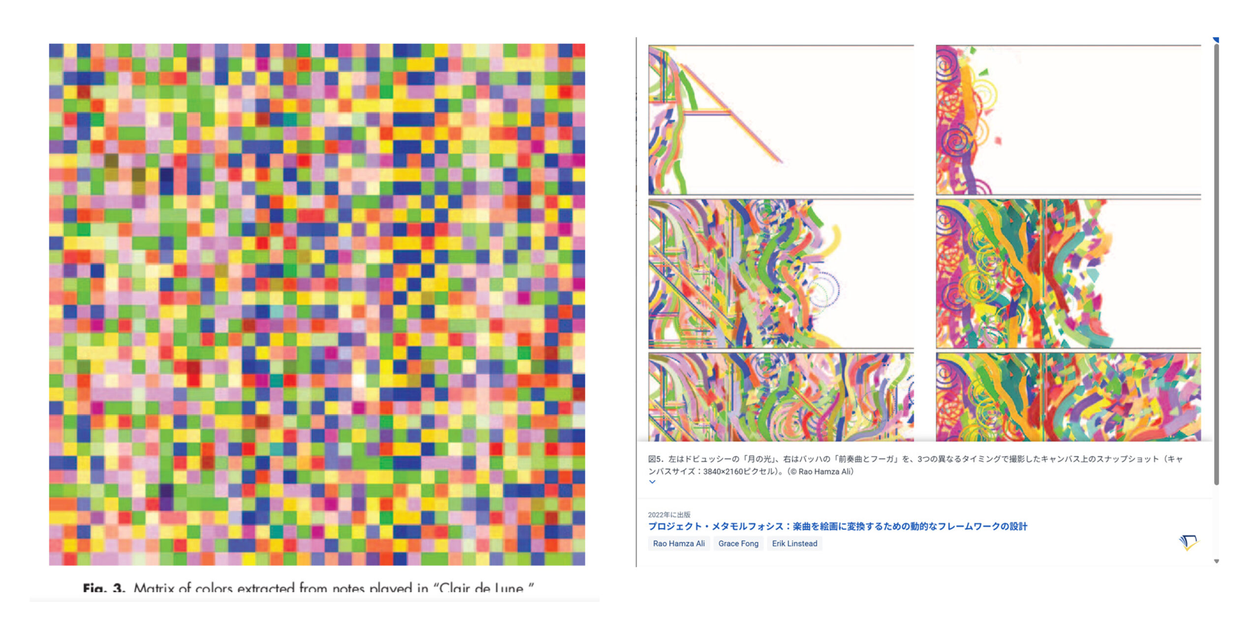
The Python library pretty_midi is used to extract tempo, timestamps, velocity, and key. All the notes of works such as Debussy's Clair de Lune are plotted, with volume represented by color intensity. - Color Extraction
Pitch is converted into 12 hues according to the Maryon chart. Brightness is changed by 25% for each octave, generating a color matrix in which small squares are arranged from left to right. - Cell (Brush Stroke) Program
One note corresponds to one brush stroke. Strength determines the size, while duration determines the distance traveled, and Perlin noise is used to create undulations. The system is implemented in Processing, with brush transparency and thickness also parameterized. - Screen Division and Symbolization
The canvas is divided into eight overlapping sections, and the drawing position is determined from left to right according to the progression of the piece. Chords are converted into symbols, such as "major triad = vertical line" and "minor triad = horizontal line," while arpeggios are represented as spirals. - Output
I have included images of the outputs, including Bach's Prelude in C Major, Chopin's Nocturne Op. 9 No. 2, and Debussy's Clair de Lune. The completed videos are described as "moving paintings in which music unfolds as an image without sound."
Problems When Compared with the Yokota Theory
This prototype was ahead of my work in terms of the framework of "automatic conversion from musical score to painting," but it does not solve the fundamental problem that I solved.
1. **There is no main key = dominant color**
There is only a mechanical rule in which major keys are made bright and minor keys dark. There is no concept of a main key color, such as "C major = red dominates the screen."
2. **There is no color version of chords**
The theory lacks a color-based chord system such as "C = red-yellow-green" and "Dm = vermilion-yellow-green-blue." Instead, it resorts to symbols such as vertical and horizontal lines. The point Matisse recognized—that colors must harmonize like musical chords—was taken further and completed for the first time by my theory.
3. **There is no correspondence for timbre, pitch, and rhythm**
There are no rules corresponding timbre to color, such as trumpet = yellow; pitch to brightness; low frequencies to dark colors and high frequencies to white; or rhythm to stripes.
4. **No representational images are displayed**
The generated works remain abstract pixels and brush strokes to the end. There is no discovery that allows a human silhouette, the Forbidden City, or a landscape such as Guilin to emerge recognizably at a glance.
5. **Intervention by impression, intuition, and arbitrariness**
Rules such as the use of Perlin noise to create movement, dividing the screen into eight sections, 25% increments, and using vertical and horizontal lines are themselves intuitive choices based on the feeling that "this looks beautiful." They are not physical laws.
The Innovation of My Theory — A Transformation from Point-to-Point to Structure-to-Structure
What I have done is similar to topology, the branch of mathematics in which Poincaré expressed complex geometric forms, previously considered impossible to handle, through mathematical formulas.
Until then, it had been said that translating music into painting was impossible.
The underlying assumption was that structures such as frequency and the organs through which humans receive input, together with their physiological mechanisms, were completely different and had no meaningful similarity.
I thought instead:
"It is absolutely possible! I will definitely discover the laws and connect them together."
Isn't this also true of most Nobel Prize and Fields Medal achievements?
"Solving this is impossible. You will waste too much of your academic life trying to solve it and eventually drop out!"
Poincaré said, "Mathematics is the art of giving the same name to different things."
Please take a look at these pages: Regular Polyhedra Club and Seigow Matsuoka's Thousand Nights, Poincaré: Science and Method.
For more details, please see this page on this site: "My combining of 'music and painting' is exactly analogous to the great mathematician Poincaré's creation of topology by combining geometry and algebra, based on his idea that 'mathematics is the art of regarding different things as the same.'" Please see this page!
* Main-key note = Main-key color — the dominant color of the image
* Chord = Color chord
* Timbre = Individual colors; Pitch = Brightness; Rhythm = the lengths of the progression of the melody and the spatial rhythm
As a result, simply drawing the musical score according to these rules produces a representational image in which anyone can associate what has been depicted with a human silhouette, the Forbidden City, Guilin, or a resort beach and its waves.
The spectrum correspondence chart itself was not the first such chart in history.
However, my theory was the first to provide a physical law by which a musical score is completely translated into a representational image, without the intervention of impression, intuition, arbitrariness, or imagination.
This, I believe, is the decisive difference between my theory and the three attempts by Iwai, Sakamoto, and Chapman, and the value of solving the major problem that had continued for 300 years.
■【PartⅠ Law for Translating Music into Painting ・・・ Here is the Python program】 I have finally unveiled and publicly released This Law , ending six years of secrecy surrounding it. Here is the Python program that demonstrates and verifies the law.【Go to this page!】
■【PartⅡ Law for Translating Music into Painting 】— Examples of Paintings in Which Color Chords Are Actually Used: Ryuzaburo Umehara’s Mount Fuji!(梅原龍三郎 富士山)【Go to this page!】
■【PartⅣ Law for Translating Music into Painting】As a Symbol of the “300-Year-Old Problem of Being Unable to Create Forms” — Rimington’s Color Piano, Which Adopted the Spectrum Correspondence Table!
【Go to this page!】